


Colors are passion, emotions and personality. At Siegwerk, inks and coatings are our specialty and we use color to bring the packaging and products of our customers to life.
Q: What was the background of the contest? Why was it focused on printed metallic effects?
Dr. Ursula Doering: Well, around 70% of all purchase decisions are made directly at the POS, so getting noticed is key for brands. Here, metallic effects are ideal for adding a special extra to packaging. Today, more and more brand owners already make use of effects and special finishing to differentiate and catch attention at the POS. Especially in the luxury segment, board packaging is often printed with metallic effects to convey exclusivity and high value of the respective product. The possibilities for creating shiny metallic effects are almost limitless. They can have numerous different color shades and brilliances and can be applied using different printing technologies. As global ink and coating manufacturer we already offer a broad range of special effect inks and varnishes for a wide range of printing processes and substrates to create any kind of effects from visual and haptic to luminescent and technical effects. In this context, we had just developed new premium metallic inks to simulate particularly shiny, mirror-like metallic surfaces. And how could you better promote this kind of print effects if not with a printed sample? Therefore, we got in contact with the Rhein-Sieg Academy of Art and Design (RSAK) here in Germany and looked into collaboration opportunities to create a nice and eye-catching mock-up design for promoting our metallic inks to our customers. The idea to organize a competition for students of the fifth to ninth semesters first came up in the course of our discussions with the RSAK. The plan was to combine industry and teaching, and to design technically very sophisticated printing technology with the fresh and modern packaging designs of the students.
Q: And how was the contest structured at the end? What was the concrete assignment given to participants, what evaluation criteria were used, etc.?
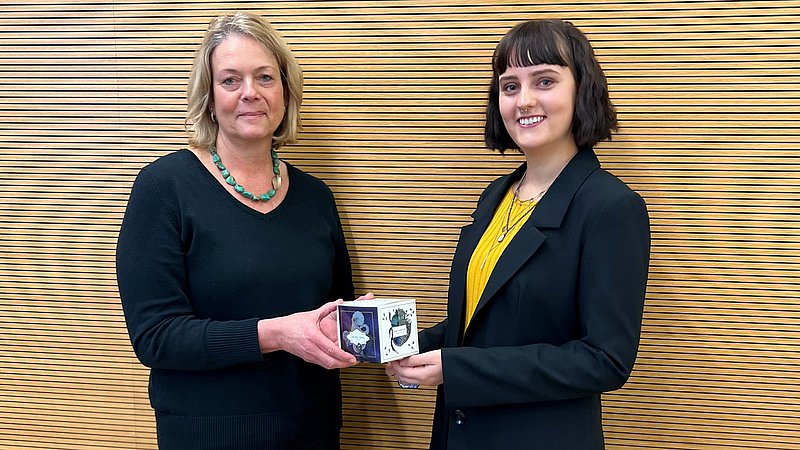
Dr. Ursula Doering: The overall task of our “Printed Metallics” competition was to show how good metallic inks can actually look on packaging. For this purpose, the participants were asked to create a design for a folding box of 10cm x 10cm that could also be used for the design of adhesive labels. The folding box should integrate different designs – each in regard to another market segment. Required were four designs representing high-quality products in the areas of chocolate, liquors, cosmetics and pharma. The designs should include metallic details in silver and gold as well as highlights in at least one other metallic color. The goal was to perfectly set the scene for our new metallic inks when printing the design. The students had one month to develop their designs before facing a jury of three lecturers of the RSAK and three Siegwerk experts from different business units. The criteria for the jury voting consisted of four equally weighted areas. First of all, the implementation of metallic effects in form of elements, lettering, lines, and so on. Secondly, the use of metallic inks with silver, gold and at least one other color as requirement. Third, the consideration of all four required market segments. And fourth, the design concept itself. Based on these criteria, each student could get a maximum of 20 points from each jury member, so in total 120 points. From 18 submitted design concepts, Emely’s received the highest score of 20 points four times and in the end prevailed as the winner with 108 points in total. All participants did a great job but her design just had this little extra!
Q: Wow, 108 points! Congratulations, Emely! Could you please shortly introduce yourself?
Emely Billig: Sure, my name is Emely Billig and I am 23 years old. Since 2018, I have been studying graphic and communication design with a focus on illustration at the RSAK in Hennef, Germany. Currently, I am in my last semester and working on my diploma thesis. After graduation I would like to work in an agency or in the illustrative area, preferably both combined.
Q: Great, then let’s talk about your winning design concept. How did you develop it? What were the thoughts behind it?
Emely Billig: Since it was about showcasing the different metallic inks, I decided to use a different base color for each of the four market segments. Each segment should stand on its own, but the cube should also work well as a whole. Therefore, I not only made sure to create a logo in the same Art Deco style for each segment, but also that the designs at the opposite sides of the cube have similarities, for example in the background or the use of illustrations. Right from the beginning it was clear to me to solve the task with hand-drawn illustrations. Thereby, I got inspired by my personal interest in scientific illustration, Greek mythology, nature, as well as various artists such as Gustav Klimt. I tried to fully exploit the technical possibilities of a printer so that the metallic inks could be highlighted at their best. Therefore, I often worked with small, delicate silver and gold details that made the overall design more valuable.
Q: Sounds like a sophisticated concept - holistic but also rich in detail. Could you give us some insights into the thoughts behind the four single designs?
Emely Billig: Of course. My idea for the liquor segment is based on “Triton's water” as a metaphor for vodka. I used an octopus ink drawing as a symbol of the Greek god in which the tentacles were refined with many small gold metallic elements to symbolize premium quality. The idea for the chocolate segment was inspired by my affinity for insects. The drawn beetle represents a lucky charm especially in ancient Egypt and I combined it with local plants and fruits, which could be used as ingredient or topping for chocolate. The design is enriched with small details in gold and silver. For the cosmetic segment I got inspired by the eyeshadow industry that has offered zodiac-based products for a while. Here, I decided to go with a Pisces eyeshadow palette with lots of filigree gold details. And last but not least, for the pharma segment I was strongly inspired by Gustav Klimt's “Hygieia”. Klimt himself worked a lot with gold, and I wanted to reflect this in my design. In order to also incorporate something of my own, I illustrated the other half of Hygieia as a silver skeleton.
Q: That sounds really thought-out, Emely! Thanks for all the insights into your design development process. Let’s now look shortly at the new premium metallic inks the designs were made for. Ursula, could you tell a bit more about them?
Dr. Ursula Doering: Right, the mock-up was designed to especially promote our new Flexo UV premium silver. The best thing about this high-quality metallic ink is that it is able to replace the metallized polyester lamination film on some packaging applications and therefore is a huge step forward towards recyclability. Often metallic effects are created by printing translucent inks on metallized cardboard. The problem: Materials refined in this way are not recyclable. Our new metallic inks do not hinder the recycling and therefore are a sustainable alternative to not being forced to forego metallic effects in packaging such as folding cartons and labels in the interests of sustainability. Besides, the new inks - depending on the area coverage of the metallic inks - can also contribute to cost savings.
Q: Looking back, what’s your overall impression and take-away of your participation in the contest, Emely?
Emely Billig: Participating in Siegwerk’s design contest was such an enriching experience for me. I am glad that I had the chance to work with experts from the printing industry for the first time – I just learned so much during this time. I had no previous knowledge of the special printing technology, but the team at Siegwerk helped me to understand the process behind it. The design work itself was also a lot of fun, because we had creative freedom for the most part and were able to incorporate our own ideas. Creating the pre-press data of the design was one thing, but holding a final print sample in my hands that was very special for me.
Q: And what about you, Ursula? What’s your personal feedback?
Dr. Ursula Doering: We have seen so much talent with great ideas, high creativity and technical finesse. We are just very happy about all the excellent results and fantastic creations in silver, gold and other brilliant metallic colors. It was such an inspiring and motivating project – a nice break from the daily work routine. Printed in UV offset respectively UV flexo for the silver, the final print samples look absolutely stunning! Thanks to Emily's nice design, the metal effects come out really nicely! We just printed 2,000 samples of it that we can now show to our customers and exhibit at future trade shows. We are looking forward to the next customer meetings already. Again, a big thank you to the RSAK, Emely and all other very talented participants!


